Too close to actually see it
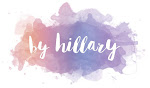
My webmonkey will be going back to school soon. That means if I want any design related work I need to get it done in the next two weeks. Last summer he overhauled my entire website and created the pink version and logo I had.
Last night I came up with a few design related tweaks you see now. (I was going for simple changes with big impact, less work for him) He wants to redo it all.
The background is now white instead of pink and the stars are changed some and softened out a ton.
The logos colors have been darkened quite a bit.
The middle text box has been widened.
The content frame has been widened.
What do you think??
Keep the current logo? Keep the little hillary? Colors?
I want more polish but I am not sure how to attain that. He is too close to it and since he created it he wants to scrap it and start fresh.
Suggestions and CONSTRUCTIVE opinions would be nice. This is my husband and well me so I don't want to hear you hate it, that is neither helpful nor nice.
RSS people will have to click though to see it.
Before
Comments
Just one suggestion though. Or something to think about.... what about making the belt on little hillary red?
If you're going for "polish" then maybe a different background? The stars are fun but I don't think they are particularly "polished"
The belt was red. Not sure what happened there. Must of got altered in the change over.
The stars are kinda my trademark. I have signed my name with them for 17 years so I want stars SOMEHOW not sure how.
The background was pink until 12 hours ago.
But you got me thinking I really need to get my ass in gear on all the posts that are languishing on my computer in a to be posted folder.
I want my blog to represent me in digital form which is very hard. Your visually trying to show people about you and it's all about looks.
I like the dialog (all be it internal) this is creating. It's good to here people perceptions.
That's all I got.
I don't think I like the white background or darker logo quite as much. Instead of making it a bit cleaner, I actually feel like it makes it a bit less defined. Maybe somewhere in between?
What is your very favorite color combination? Do you have a palate that you always find pleasing? What if you created some design elements with your own hand-drawn stars to add a little whimsy?
I do like the wider columns, and don't get me wrong, the website still looks very good. Just my two cents, since you asked. :)
This is my favorite color palette and they are hand drawn stars. heee. It was easier to see when they were bigger and darker I think. My husband did them from my sketch book.
You can see the handdrawn ones here better (basically yesterdays site)
http://farm4.static.flickr.com/3167/3856685310_e2643c5077_o.png
I can't tell if I miss the brighter pink b/c I was used to it or because it's pink. But an in between might be nice.
The red in your shoes and the banner-thing looks really good.
-b-
I'd say stick with what you love. :)
I think the logo is a mixed bag. The white background makes the lipstick smear obvious. I didn't know what it was, besides a mark. Now it is coolness. Love it.
The darker letters conspire with the you-image to create an impression of portliness. The colors are so similar, that your shape is broadened.
Can you find a newer image for the logo? You recently have become more slender, whether by slight of hand or actually. Why not update your image as you are updating your logo?
Your blog is very visually appealing. Great job.